PROJECT: Waterloo Central Railway
Website Redesign & Information Architecture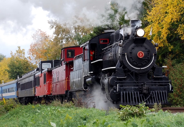
Platform: WordPress
Features: Mobile & Tablet Responsive
Completed: 2016
A Website Redesign and Information Architecture project for a Waterloo Region not-for-profit historic railway, which runs between St. Jacobs Market, St. Jacobs Village, and Elmira, Ontario.
Project Goals
- Reduce the number of customer phone inquiries.
- Focus on advertising revenue-generating activities.
- Align with the desired historical “Tuscan Red” brand.
- Make adding new content easy for volunteers.
Main Challenge
Although the original Waterloo Central Railway website was developed very professionally, it did not serve customer needs. It contained a significant quantity of information but lacked the most important information that prospective customers needed: when, where, and how they could ride the train.
Solutions
Discovery
The discovery process included:
- Informal usability testing with task scenario based on user profile.
- Discussions with stakeholders.
- Review of other historic railway organizations.
Informal Usability Assessment
Based on an agreed-upon user profile (a family wanting to ride the train with their kids during summer holidays) and user scenario (schedule the train ride into the family’s day, buy tickets, successfully board the train), Deborah completed an informal usability assessment of the website before she had become familiar with it.
She encountered significant difficulty finding the information she needed to understand where and when to catch the train, where it would go, and how to buy tickets—all of the logistics she needed to schedule a train ride into her family’s vacation day.
Recommendations
Based on her experience using the website to complete a task, discussions with stakeholders, and reviews of other historic railway organizations’ websites, Deborah formulated a list of recommendations by priority for the new site. These formed the foundation for the site redesign.
Re-Branding
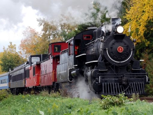
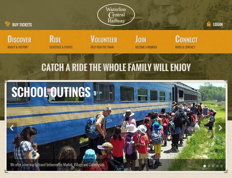
The old website was branded based on the organization’s diesel train with a number of “fun” but modern fonts and details. But, the railway’s paper marketing materials used “Tuscan Red”—a very traditional colour for historic trains—and fonts and detailing reminiscent of a more historic and sophisticated feel, which aligned well with the organization’s most prized red-and-black steam engine.
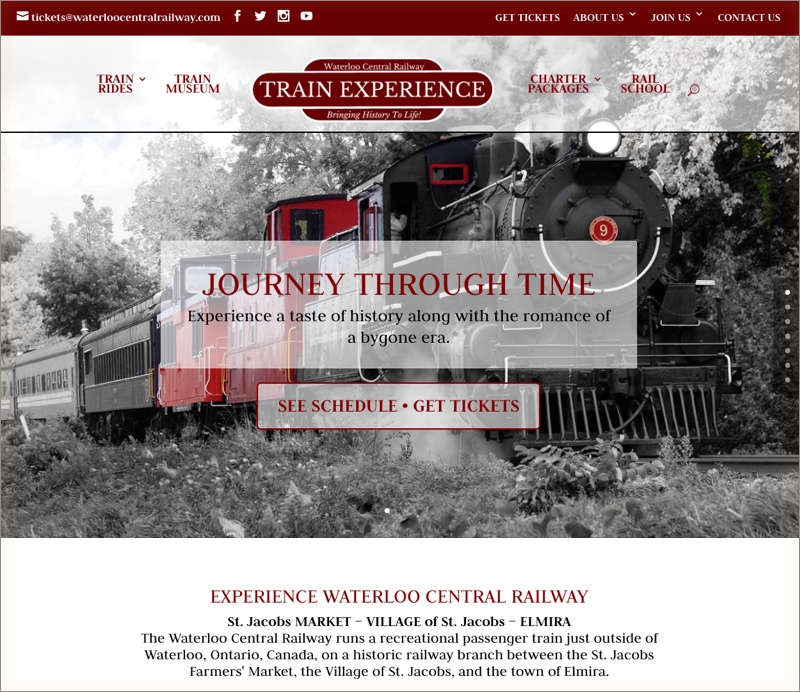
Deborah rebranded the site to align with the railway’s desired colour scheme (Tuscan red with gold accents), with new imagery, and more traditional fonts.
New Imagery
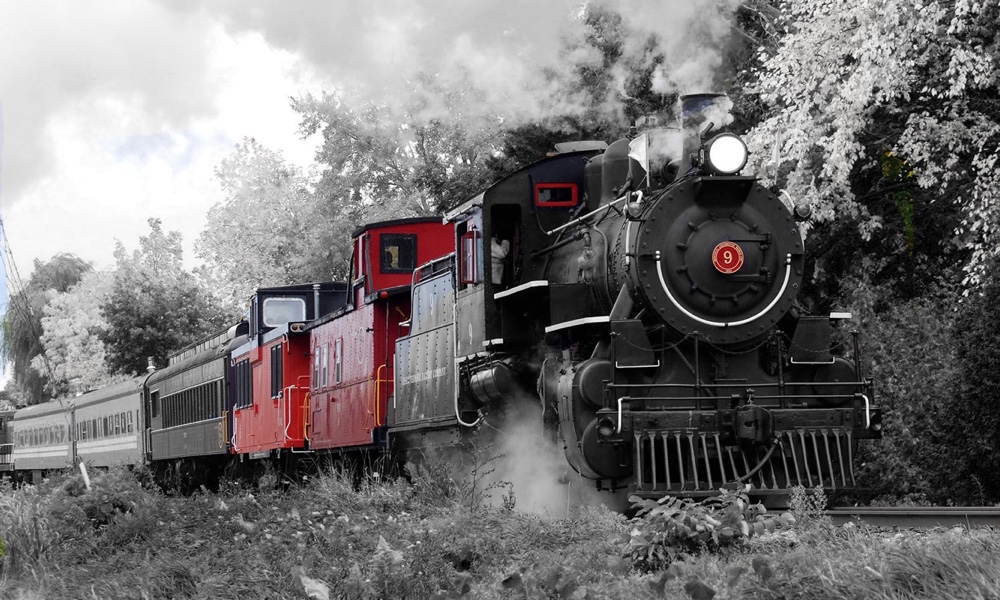
A homepage slideshow image with stylized black-and-white photographs with red highlights.
Original Homepage
Sitemap
A number of iterations of new Sitemap configurations (the navigational structure of the site) were sketched out as simple tables and lists in a Microsoft Word document. Later, in order to help the stakeholders to picture how the navigational structure would look and function, Deborah created mockups on a staging server.
The new sitemap effectively separated organization-centric information (About and History) and customer-centric information (Ride the Train, Visit the Museum), giving the revenue-generating customer-centric information prominence.
As the organization was in a state of flux at the time, and were in the process of developing new offerings, including a museum, the sitemap evolved through several iterations.
Sitemap Final Version
The final version incorporated a Train Museum and Charter Packages, services which the organization initiated mid-way through the project.
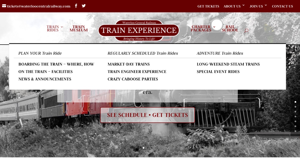
Sitemap Version II
Your Journey Dropdown
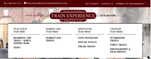
Our History Dropdown

Workin’ on the Railroad Dropdown

Content Editing & Information Architecture
The new project focused extensive time on editing existing content to condense and re-architect it into concise, easy-to-scan information, as well as writing new content that catered specifically to the needs of potential riders.
The updated information and architecture has significantly reduced customer calls and the burden placed on volunteers to answer customer questions.
Mobile Responsive Content Sections: Like all our WordPress-based websites, this site is tablet and mobile responsive—in mobile, content sections “stack” vertically. Deborah paid close attention to the order in which the content stacked on mobile screens, recognizing that many users would visit from a mobile device.
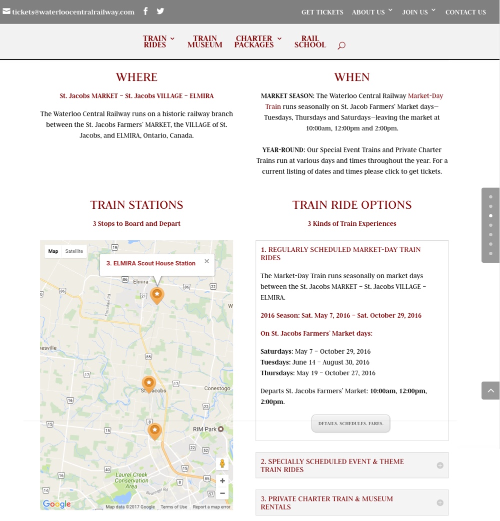
Homepage Details
The homepage clearly communicates all of the details needed to understand how, when and where to ride the train.
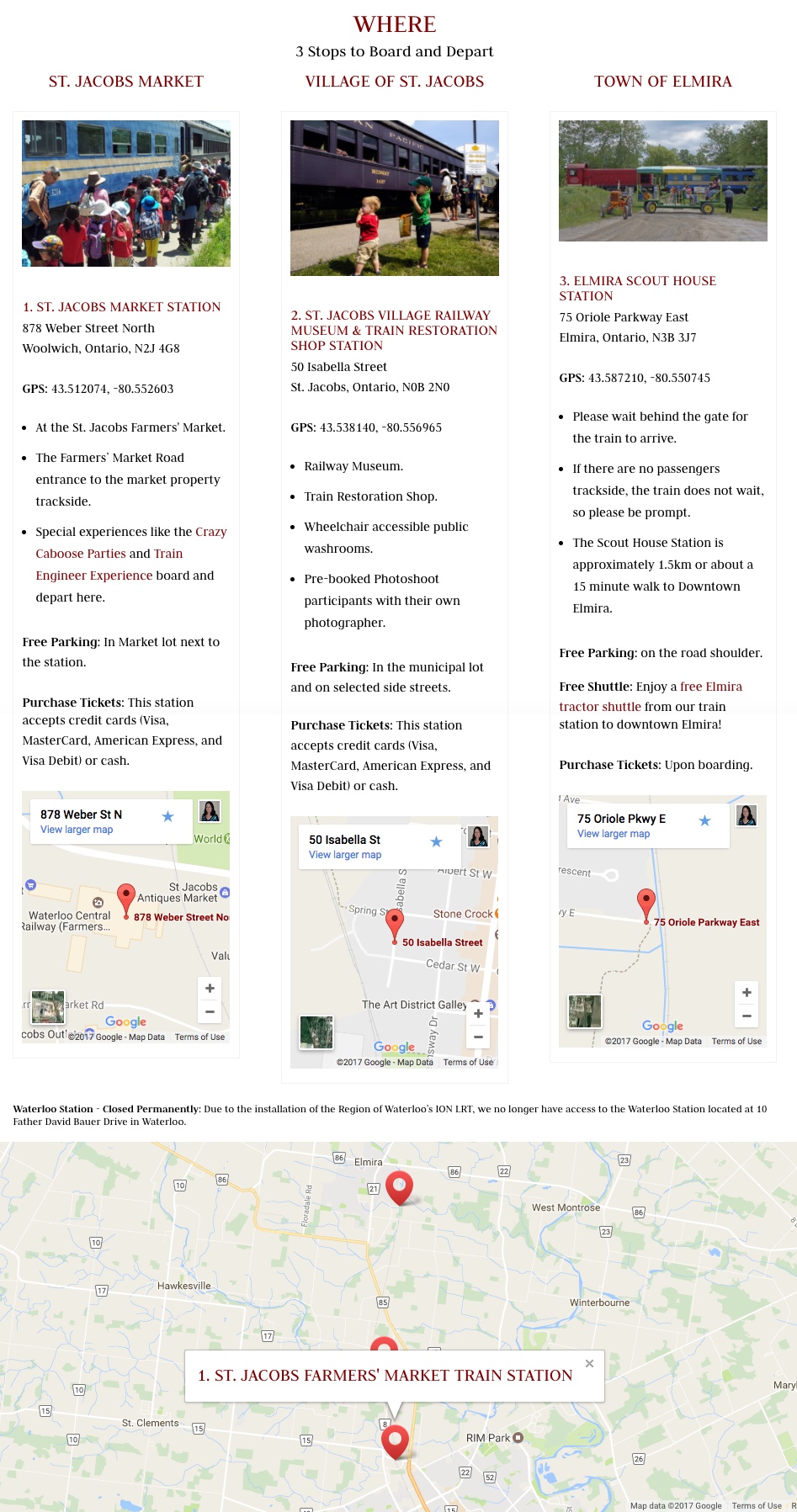
Boarding the Train Page
The Boarding the Train page provides a clear, detailed understanding of where the train runs and the stops.
Site Maintenance & Training
- Tried, tested, true, highly functional theme.
- Training and Documentation.
- WordPress monthly maintenance package to keep the WordPress installation running smoothly and ensure regular backups sets were saved off-server.
In choosing a WordPress theme, Deborah considered ease up updates. The Divi them chosen incorporates a “Divi Page Builder” as well as a Template Library, which both significantly simplify building new pages and editing existing ones.
The project included meeting with the project team to teach them how to edit and create content on the site. Deborah also pointed them to Divi’s extensive online tutorials and documentation.
Your Project Here.
Take the first step to making your project a reality.
What We are Doing...


